Ashenden
Ashenden
Ashenden
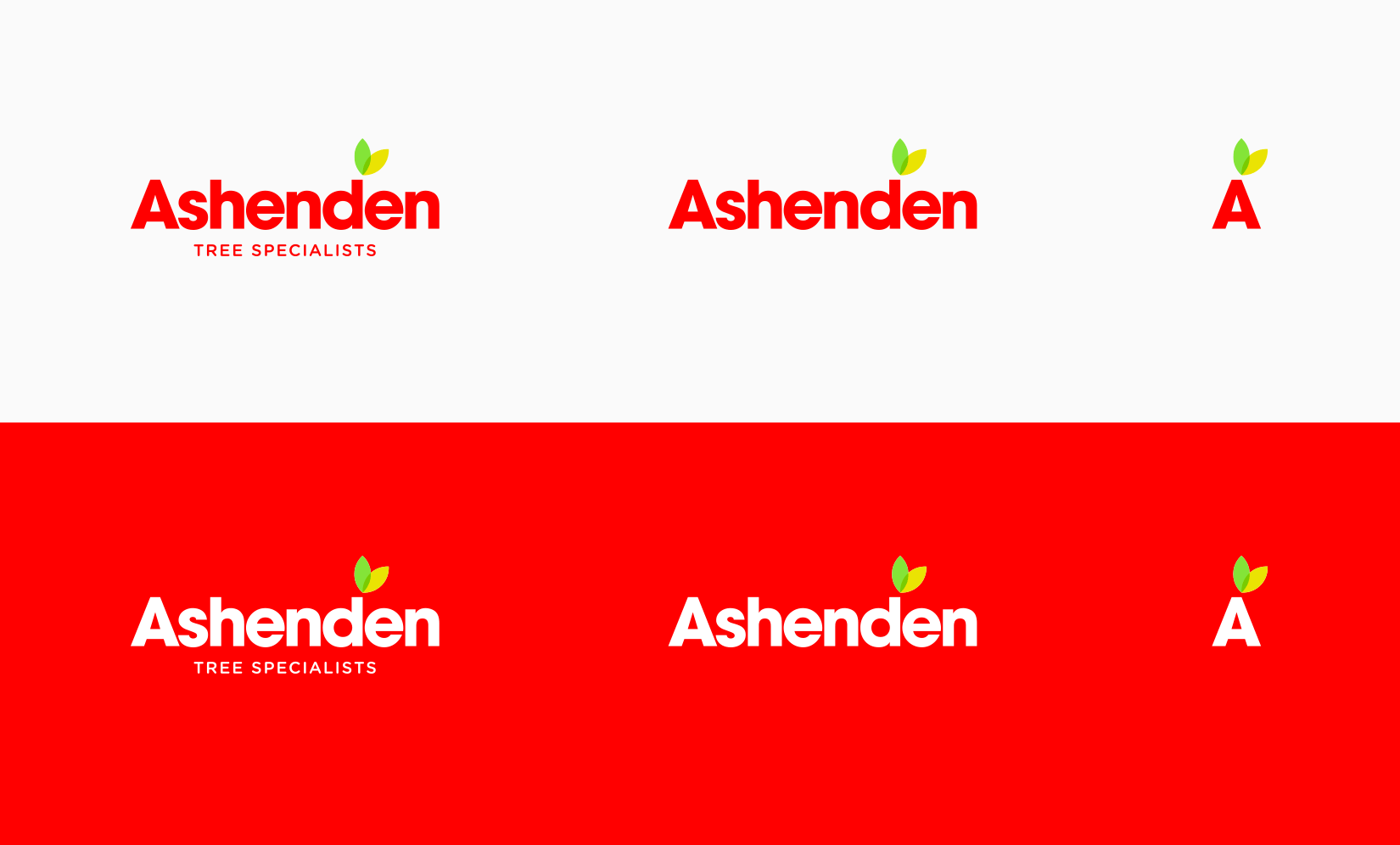
Ashenden Tree specialists are a team of expert tree surgeons. I was asked to create a visually unique brand which would help separate them from the competition.
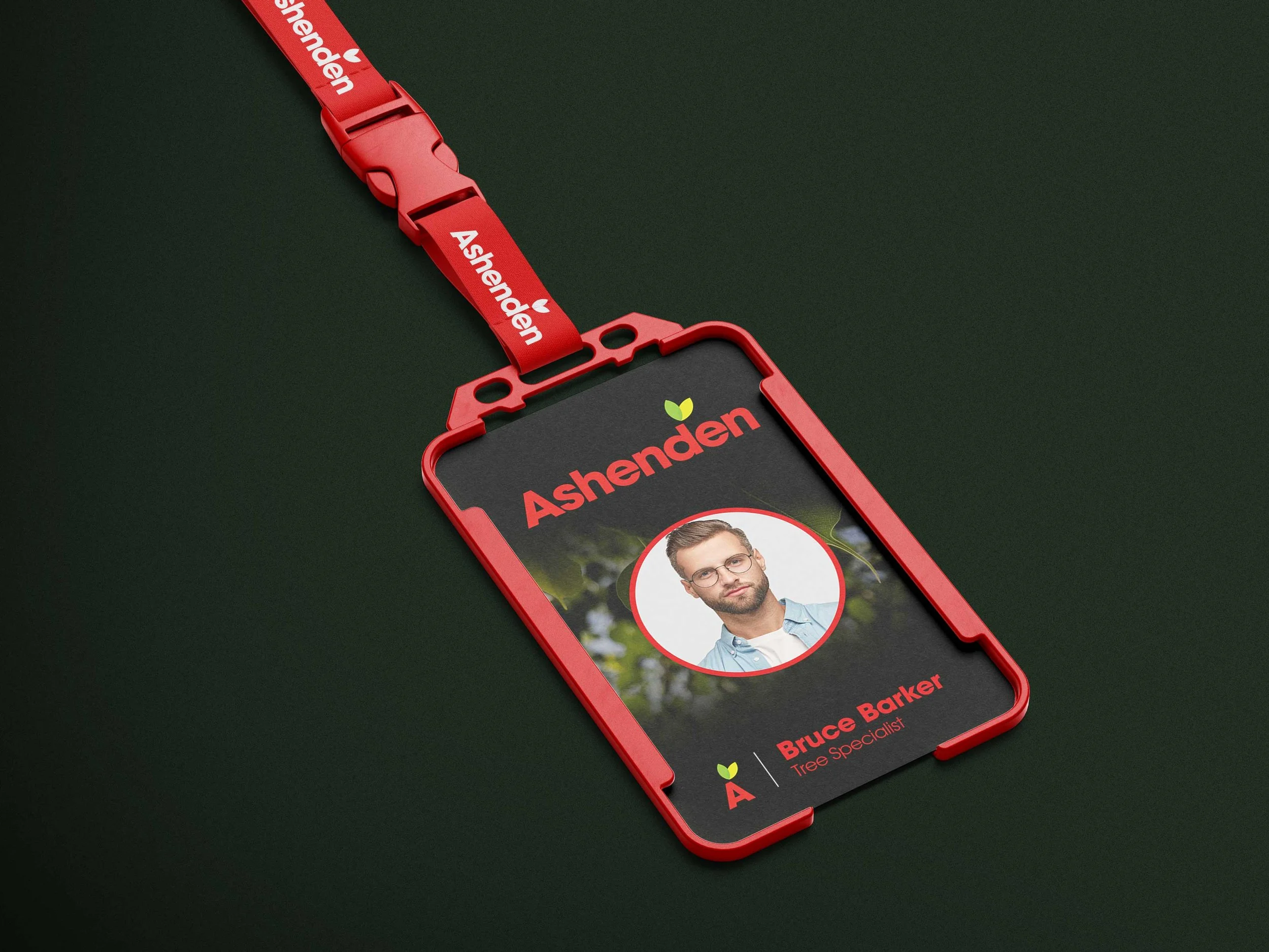
Bright red was chosen as the main brand colour to contrast with the plethora of earthy tones used by competing companies. This bold confident statement is reflected by the sturdy san serif letter forms. A small spot of yellow and green is used on the leaf element to add personality to the letterforms and is greatly accentuated by the prominence of red. A series of icons communicating the different services were created to ensure clear communication.

Services used: